PRAIM C.I
As core elements establishing identity of PraimCo.,Ltd. and shaping the company’s integrated image, it should prevent any image damage such as distortion, transformation, abuse etc. from occurring.
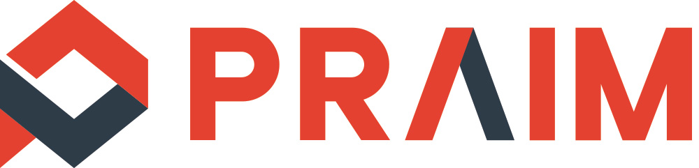
Symbol
The symbol of PraimCo.,Ltd. represents ‘fire’ and ‘water’, both required in the kitchen, shaping PRAIM’s‘P’.
‘Fire’ represents rising up and ‘water’ flowing down property each, the point where Warm Red andCool Gray meet represents the contact point with customers, which contains Praim’s value.
Logo Type

Logo type of PraimCo.,Ltd. represents the belief that all products can be safely used, and innovation for providing better products, signifying Praim’s future ceaselessly challenging for customer satisfaction, based on communication.
Main Color
RED
Pantone 485 C
C 5 M 90 Y 90 K 0
R 224 G 56 B 34
Cool grey
Pantone 432 C
C 80 M 65 Y 50 K 45
R 43 G 59 B 74
Use spot color (Pantone Color) according to the office regulation, however, by feature of applied medium, set CMYK or RGB as standard.